Redesign: organic keyword performance visualisations
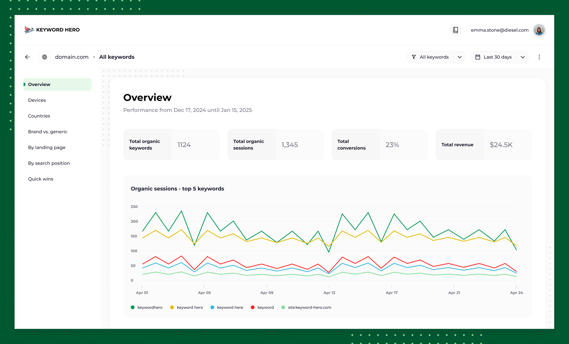
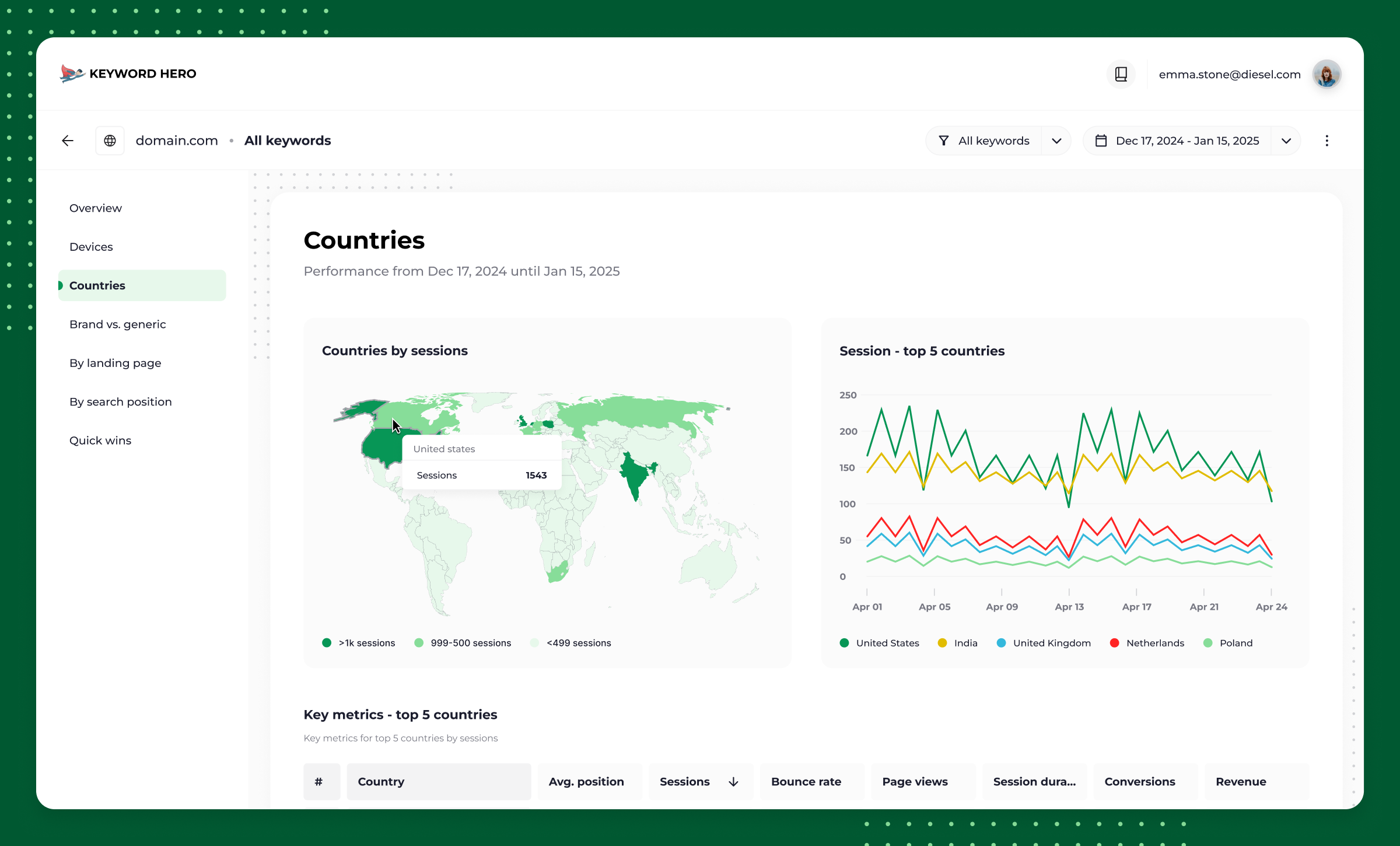
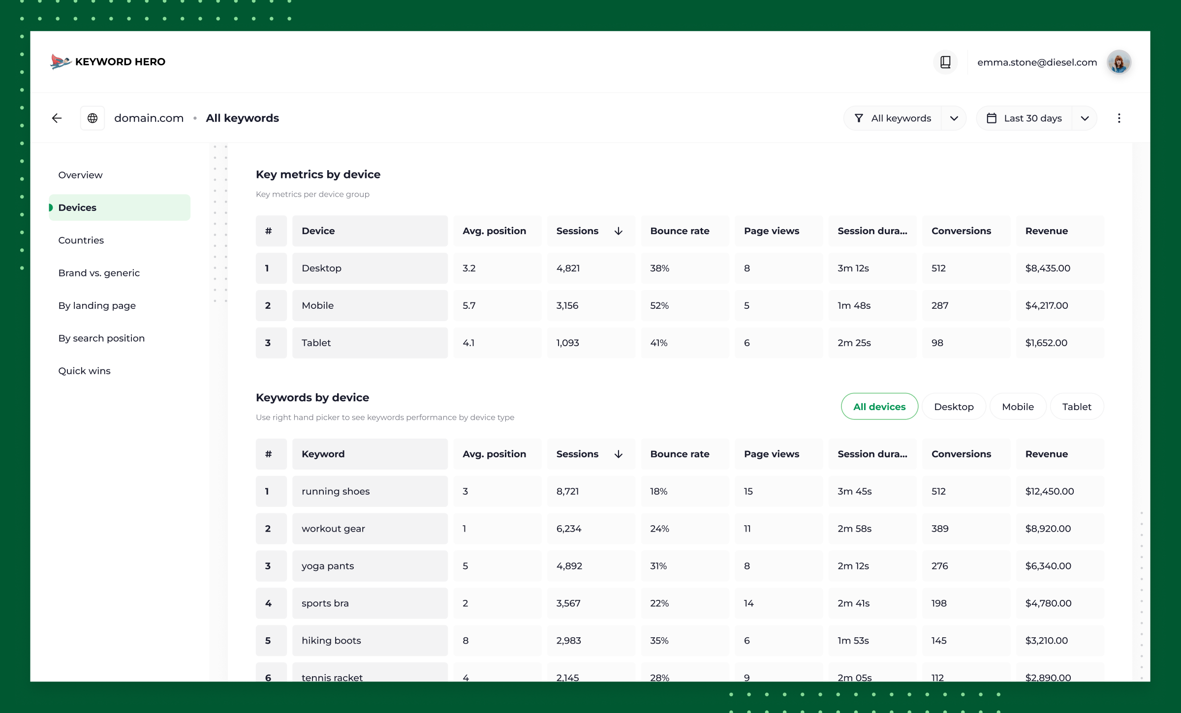
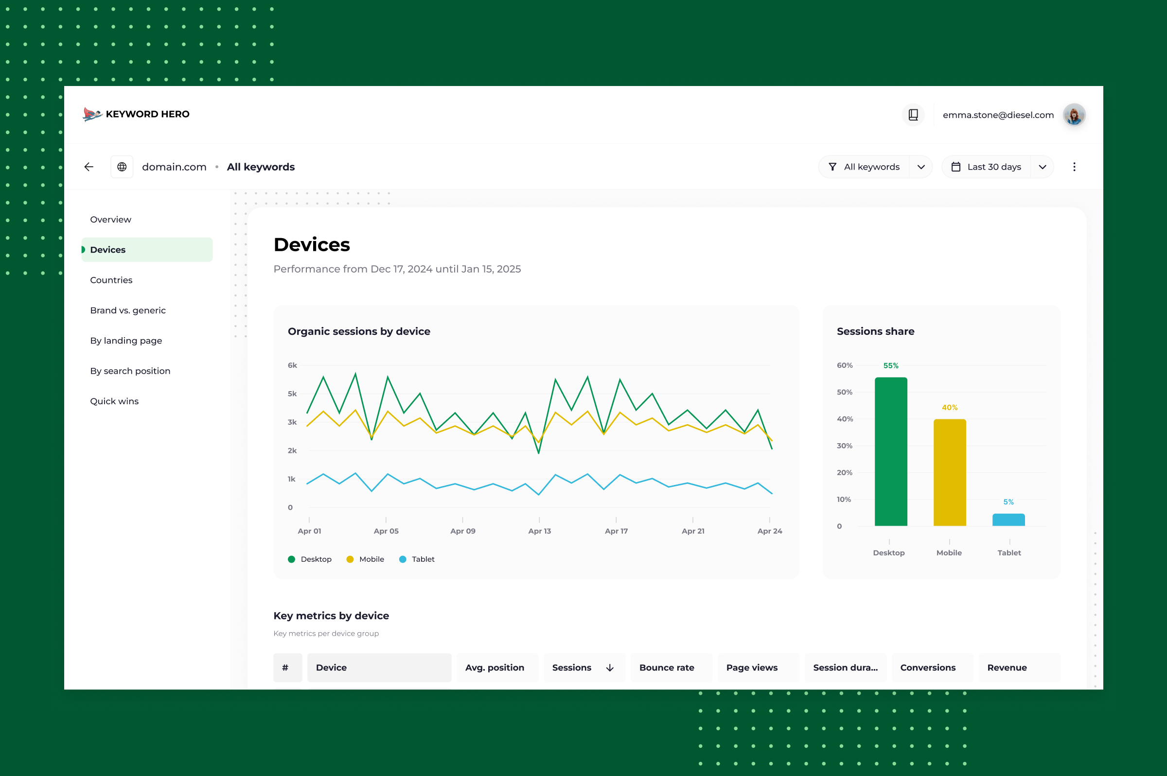
Redesigned core platform features to accommodate data visualisations migrated from externally stored reports.
- DATA VISUALISATIONS
- DASHBOARD
- REPORTS
- Company
- Keyword Hero
- My role
- Lead Designer
- Team
- 1 founder/engineer, 1 designer
- Timeline
- 1 month
- Platform
- Web app (desktop-first)
Context
Keyword Hero occupies a niche in the SEO market, helping users understand which keywords drive their organic traffic. With that insight, they can see which keywords convert best and prioritise their SEO effort accordingly.
Problem
Users trickled away
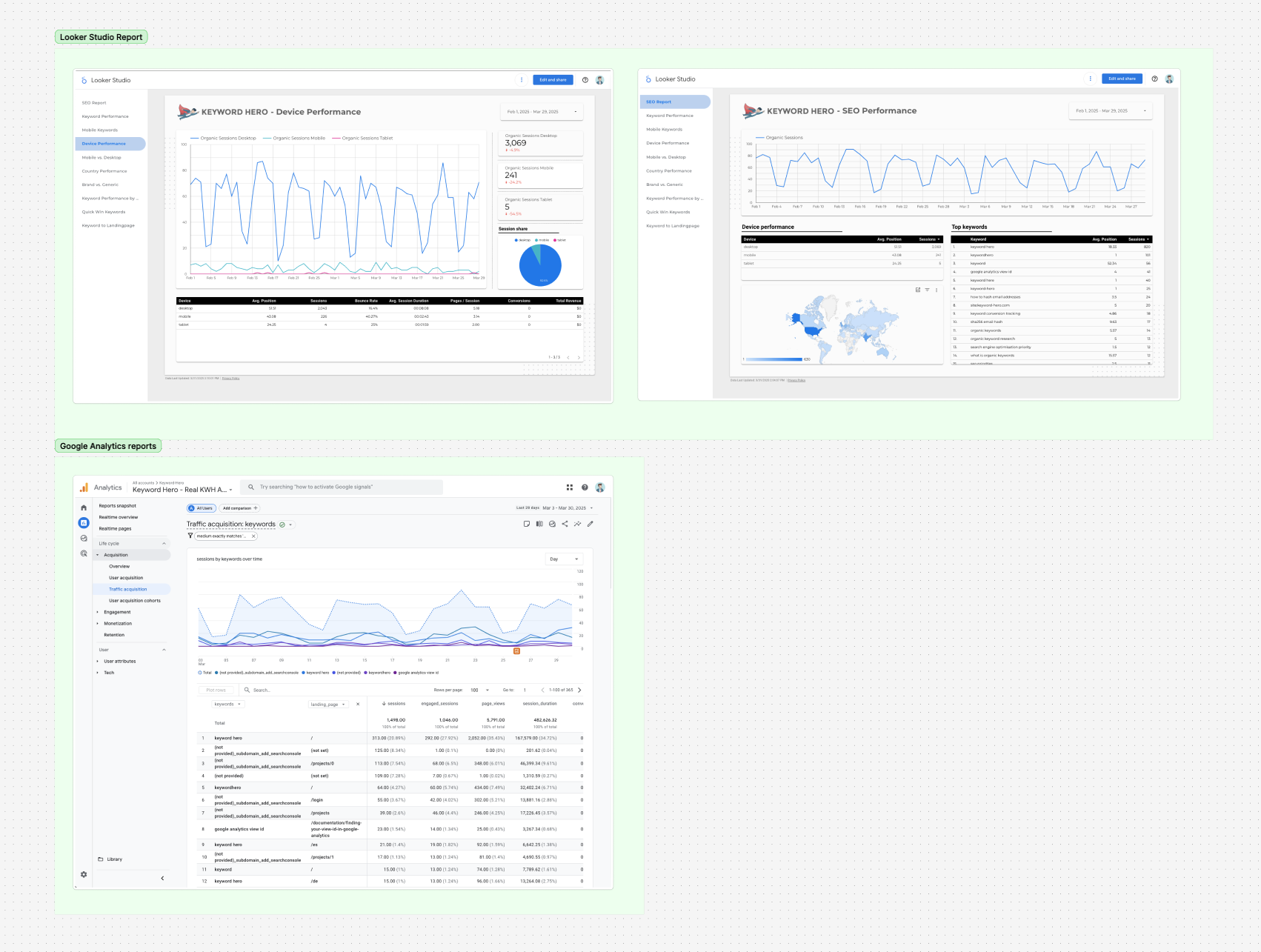
Keyword Hero handled keyword discovery and decoding, but for performance metrics and visualisation, users were sent to Looker Studio or Google Analytics. Beyond the friction of switching context, users simply left the platform, and often didn't come back. That was a real risk to paid conversion and to the habit-forming use that keeps a product sticky.
Solution
Get the users to stick around. And upgrade.
Bring performance viewing into Keyword Hero itself, so users can track their keywords without leaving the tool. This will cut the friction of the old workflow, make the product more competitive against dedicated analytics platforms, and open potential pathways for increase in conversions to paid accounts.
Approach
Identify concerns, constrains and objectives
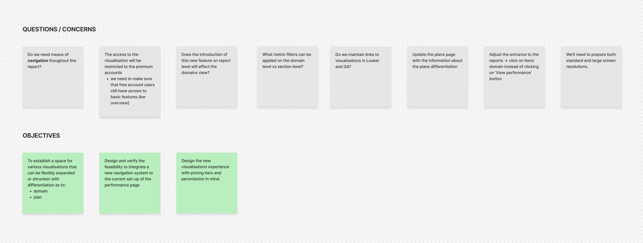
Open brainstorm, capturing questions and concerns that shaped early conversations about scope and technical constraints.
Analysing the legacy solution
I reviewed the reports available in Looker Studio and Analytics tools to identify which modules mattered most and where the offering could be simplified. V1 had been built by a part-time developer and covered a far narrower set of visualisations.
Planning & drafting
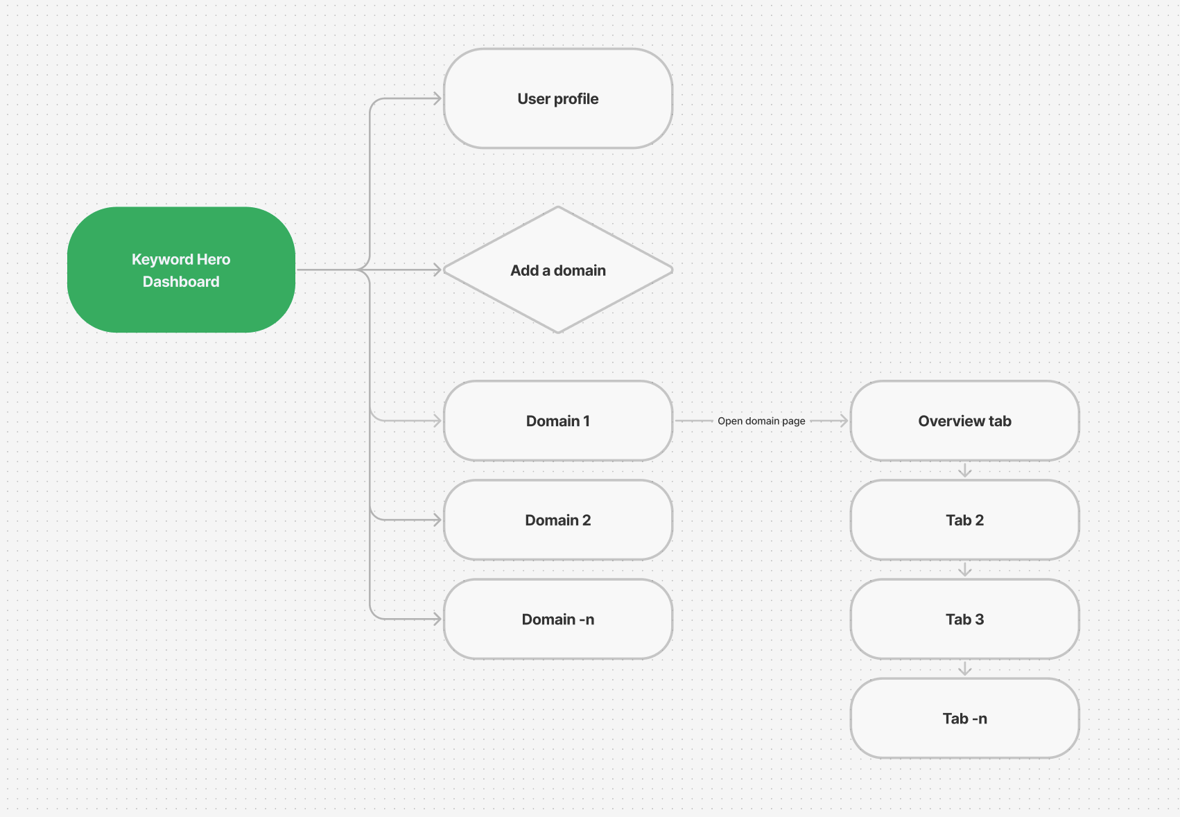
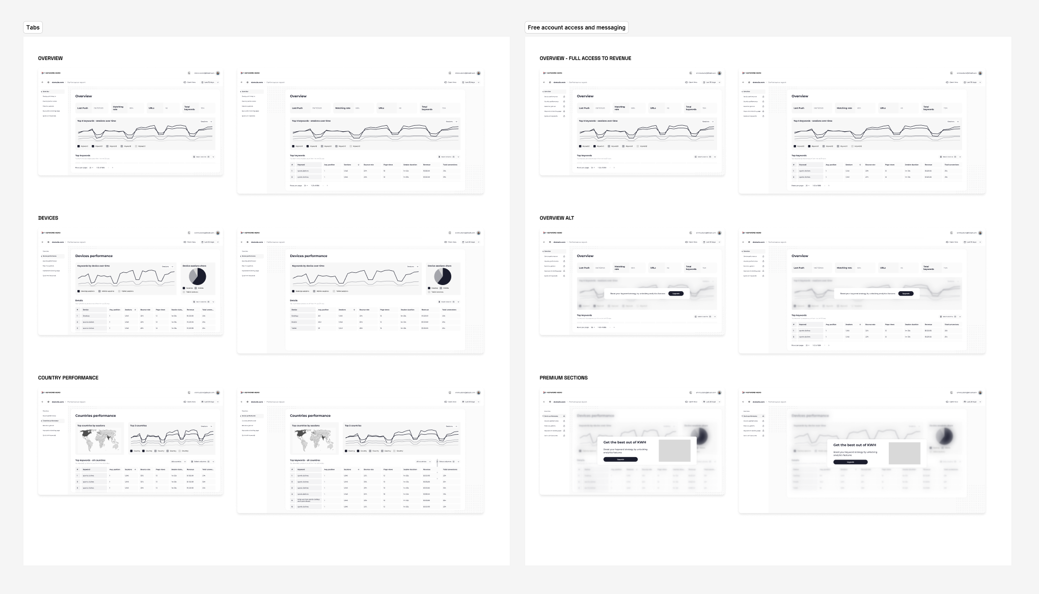
Until then, the platform was essentially a collection of external links, which gave us flexibility to design a new dashboard view and new domain-performance entry points from scratch.
Tiered access
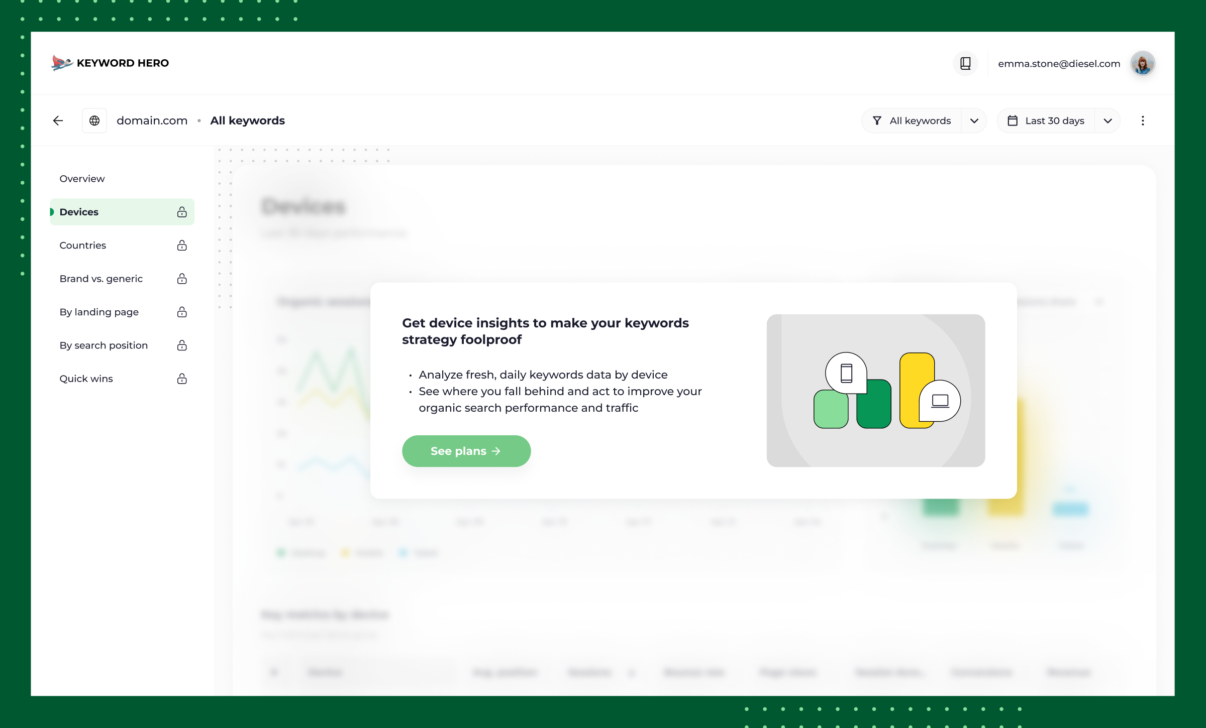
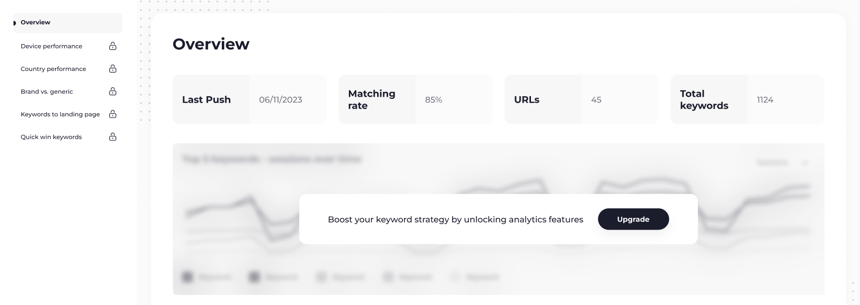
Since increasing paid conversions was a core objective, I split the topical reports across separate tabs: high-level insights available to all users, deeper analysis gated behind a paid plan.
Design decisions
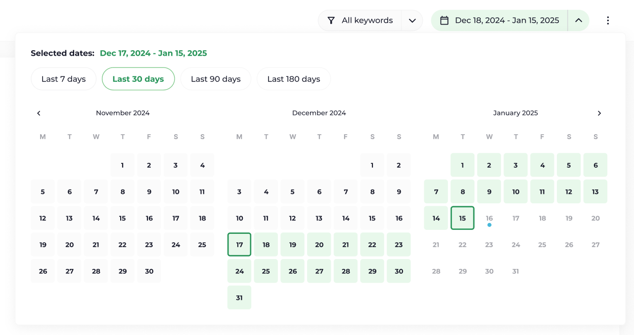
Date picker vs. timeframe picker
Letting users pick exact date ranges would have given the most precise control over the data shown, but technical discussions showed this was too costly to build. We settled on a timeframe picker (last 10/30/90 days) instead, which matched how customers typically review domain performance.
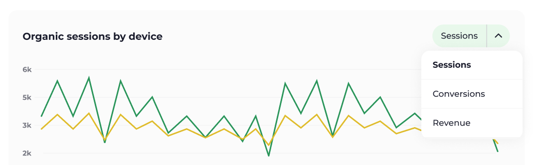
Cutting the metrics selector from V1
Organic sessions is the most direct signal of a keyword's strength, but transactional metrics would have opened the door to deeper analysis. Tracking and modelling those as a daily time series would have added significant backend work, so V1 shipped with organic sessions only. It still gave users a clear read on keyword performance.
Outcome
How it landed
The launch shipped with 3 of the 6 planned reports live. Even at that reduced scope, it drove an increase in plan upgrades, with the strongest pull coming from users who hit the locked reports on the free plan.